Graph Data Visualization
Summary
Graph databases provide a great deal of flexibility in managing object relationships. Some of the terms used in this area are nodes\vertices and links\edges. Two popular graph databases are Neo4j and AWS Neptune. The content below describes some options to display such data visually.
 Nodes and Links Diagram
This is the custom cell most relevant to graph data. It renders inter-relationship visualizations. This custom cell provides 2 display options
- Network and
- Sankey.
Their usage is described in more detail below.
Network Diagram
Overview
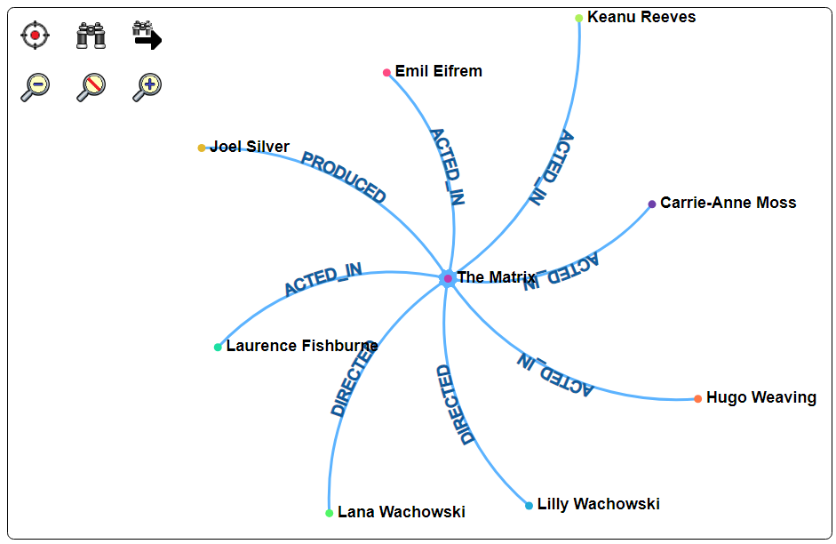
This diagram option is a traditional network diagram showing relationships amongst nodes. Below is sample output from this cell.
General Usage
The cell formula result for this custom cell is either:
- a list with nodes and links, or
- an object with nodes and links fields.
Each node has some name field. Each link's source and target values are zero based indexes into the nodes list.
The “mergeNodesAndLinks” macro function is often used to create the required value for the custom cell. The first form uses a single lookup table.
nodesAndLinks = mergeNodesAndLinks(lookUp1, links, nodeIdField, linkSourceField, linkTargetField, nodeNameFields, excludeLabel)
The second form uses 2 lookup tables.
nodesAndLinks = mergeNodesAndLinks(lookUp1, lookUp2, links, nodeIdField, linkSourceField, linkTargetField, nodeNameFields, excludeLabel)
The following arguments may be left as null.
| Argument | Description |
|---|---|
| nodeIdField | The field for the node identifier. This is used to find the objects in the look up tables. |
| linkSourceField | The default linkSourceField is ‘source’. |
| linkTargetField | The default linkTargetField is ‘target’. |
| nodeNameFields | A prioritized list of field names to obtain node names used in the diagram display. |
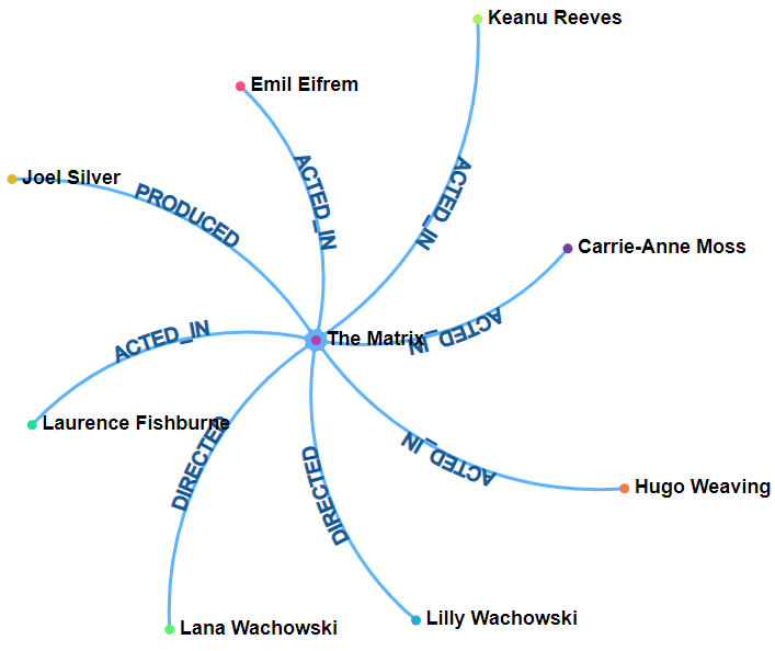
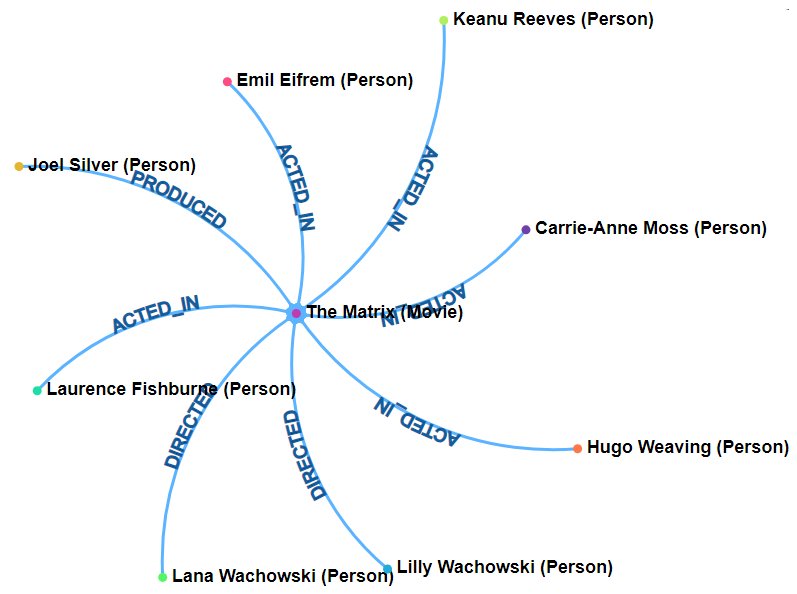
| excludeLabel | The default is false. If true then the node names display are of the form “Name (Label)”. Think of the label as a class type. Movie and Person are examples. Displayed content would be “Tom Cruise (Person)” vs. “Tom Cruise”. |
Sample Template
The sample output above is complementary to the text representation shown below.
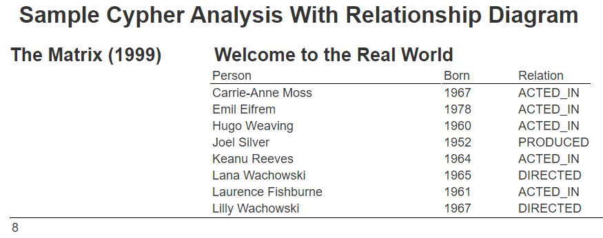
The query for this is shown below.
MATCH (person: Person)-[relatedTo]-(movie: Movie {title: "The Matrix"})
RETURN*
order by person.name
limit 15
Running this results in the following.
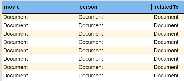
A sample row is shown below with the Movie and Person objects and the relationship object.
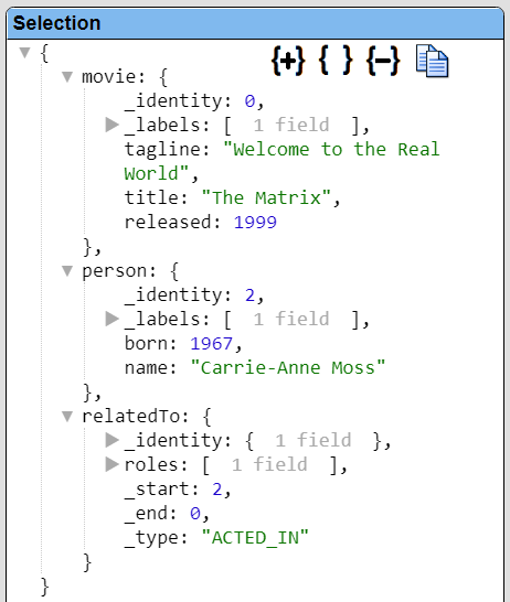
In this output each row has the equivalent move value. There is a row for each person and relatedTo pair. The person’s _identity value can be either the _start or the _end value within the relatedTo object which represents a link\edge of the graph.
A Data Source example is at “example/Neo4j/Neo4j movies for diagram”.
The template is going to track the unique movie and person objects using look up tables. These tables are created with these suppressed cell formulas.
movieNodeTable = createLookupTable( listWith(), '_identity', null, 'movie')

personNodeTable = createLookupTable( listWith(), '_identity', null, 'person')
For the movie table the keys are prefixed by ‘movie’ and for the person table by ‘person’. This allows a movie with ID 123 and a person with ID 123 to not conflict later.
The createLookupTable function signature is shown below.
table = createLookupTable(sourceList, keyField, valueField [,keyPrefix] )
The links are tracked in an array which is created using this suppressed cell formula
linkList = listWith()
The rows are iterated through and the body lines processed once per row. The following lines add to the lookup tables which do not allow duplicates. Thus, we end up with only a single movie once all the rows have been gone through. These are the suppressed body line cells.
lookupTableAdd(@movieNodeTable, #movie)

lookupTableAdd(@personNodeTable, #person)
The movie with an _identity value of 123 ends up in the lookup table with a key of ‘movie123’.
To track the links we use the following formula
listAdd(@linkList, documentFromKeyValues('source', concat('person', #relatedTo._start), 'target', concat('movie', #relatedTo._end), 'name', #relatedTo._type) )
This formula creates an object with source, target and name fields. The concat() function creates the key values corresponding to how the movie and person lookup tables were defined. We use dotted path notation “#relatedTo._type” to obtain the relationship display value such as “ACTED_IN”.
Once all the rows have been iterated through we have 2 lookup tables (movie and person) and a links list. The nodesAndLink object is created using the following suppressed cell formula.
nl = mergeNodesAndLinks(@movieNodeTable, @personNodeTable, @linkList, null, null, null, ['title', 'name'], true )
The text to display for a node may be a movie title or a person name. Thus the ['title', 'name'] argument.
The “true” argument indicates whether to display the _labels of the object as well. This is like the class of the object. Shown below is the display for when the excludeLabel argument is true vs. false.
| excludeLabel is true | excludeLabel is false |
|---|---|
 |  |
This template is in the catalog at “example/Neo4j/Neo4j movie diagram”.
In the result display right clicking on a node presents a pop up menu as shown below.
Shown below are the properties for this node.
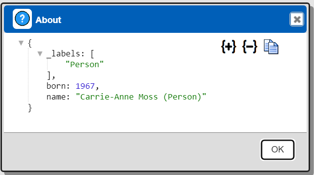
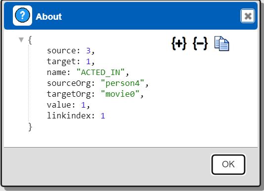
Below are the properties for one of the links\edges in the graph.
Sankey Diagram
Overview
A Sankey diagram is a chart that uses arrows and nodes to show how values flow from one node to another. The width of the arrows indicates the value/weight of the flow. Sankey diagrams are often used to visualize the flow of energy, materials, or costs.
Sample Diagram 3
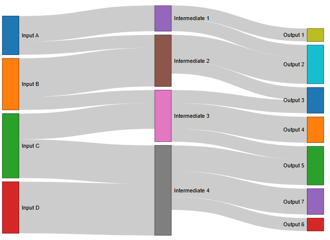
The default flow link color is gray as shown below.
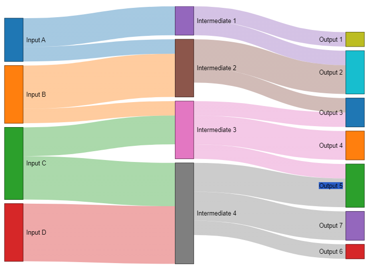
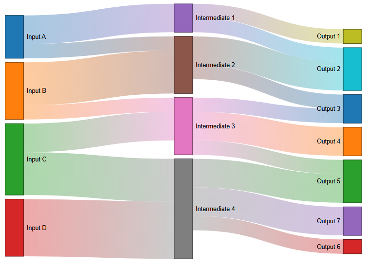
To use colors define an object in the Draw Options as shown below.
Here are the possible combinations.
| {linkColor: true, linkColorGradient: false} | {linkColor: true, linkColorGradient: true} |
|---|---|
 |  |
The far left nodes provide an amount of output which propagates to the right through the links which have a value field. The total input amount to a node is equal to its total output which continues propagating to the right.
The Sankey diagram above shows the following set of data.
{
"nodes": [
{ "id": 0, "name": "Input A" },
{ "id": 1, "name": "Input B" },
{ "id": 2, "name": "Input C" },
{ "id": 3, "name": "Input D" },
{ "id": 4, "name": "Intermediate 1" },
{ "id": 5, "name": "Intermediate 2" },
{ "id": 6, "name": "Intermediate 3" },
{ "id": 7, "name": "Intermediate 4" },
{ "id": 8, "name": "Output 1" },
{ "id": 9, "name": "Output 2" },
{ "id": 10, "name": "Output 3" },
{ "id": 11, "name": "Output 4" },
{ "id": 12, "name": "Output 5" },
{ "id": 13, "name": "Output 6" },
{ "id": 14, "name": "Output 7" }
],
"links": [
{ "source": 0, "target": 4, "value": 10 },
{ "source": 0, "target": 5, "value": 5 },
{ "source": 1, "target": 5, "value": 15 },
{ "source": 1, "target": 6, "value": 5 },
{ "source": 2, "target": 6, "value": 10 },
{ "source": 2, "target": 7, "value": 15 },
{ "source": 3, "target": 7, "value": 20 },
{ "source": 4, "target": 8, "value": 5 },
{ "source": 4, "target": 9, "value": 5 },
{ "source": 5, "target": 9, "value": 10 },
{ "source": 5, "target": 10, "value": 5 },
{ "source": 6, "target": 10, "value": 5 },
{ "source": 6, "target": 11, "value": 10 },
{ "source": 6, "target": 12, "value": 5 },
{ "source": 7, "target": 12, "value": 10 },
{ "source": 7, "target": 13, "value": 5 },
{ "source": 7, "target": 14, "value": 10 }
]
}
To display a Sankey diagram in Qarbine, pass in an object with a nodes array and a links array. The link’s source and target values are index values base zero back to the nodes list elements. See the table above for the use of nodeFieldId, linkSourceField, and linkTargetField arguments in the mergeNodesAndLinks macro function.
There are several techniques to accomplish this which vary based on the retrieved data. The set of layout cells used in the network diagram example above is one approach. The important aspect with the Sankey diagram is that the links have values and the sum of the inputs equals the sum of the outputs.
A Sankey example is at “example/Custom cells/Sankey diagram example 1”.